
HW0 - First Blog Post
A Quick Python Visualization Tutorial
Hello world (read: the UCLA computing sphere)! To get my feet wet with our PIC16B blogs I’m going to walk us through a useful visualization for the—you’re probably sick of it if you took PIC16A—Palmer Penguins data set.
A big part of the final PIC16A Machine Learning project was feature selection: the project spec itself limited you to two quantitative and one qualitative variable to train all three of your models on. Sure, you can automate a brute force validation of every combination (I did just to be sure), but datasets won’t always be so fortuitiously compact, so you best get smart about it.
One I thing I noticed in other team’s projects was that they tended to shy away from the last introduced of our 16A visualization packages, seaborn…and I get it, it’s finicky and less customizable than the more familiar matplotlib functionality it wraps and intertwines with, but when you color within the lines and use it for something it does well, man, is it pretty. The example I’m going to walk through here is something I had to do in pyplot as per the spec of an earlier assignment using U.N. data, and it really made me appreciate seaborn. Writing loop heavy functions to integer division and modulo your way through an automated, scaleable, layout of matrix plots feels, I hate to use this word, un-pythonic. It reminds you of writing C++ code except it’s still not as fast, everything is still by ref without explicit qualification, and you don’t get to be an elitist about it. With this in mind, let’s look at a cool, easy way to plot variable pairs to get a prelimary understanding of which have the least interspecies overlap in distributions (and thus make for good variables for distinguishing between penguin species).
So let’s get started with our imports:
import numpy as np
import pandas as pd
from matplotlib import pyplot as plt
import seaborn as sns
# Import data
url = 'https://philchodrow.github.io/PIC16A/datasets/palmer_penguins.csv'
penguins = pd.read_csv(url)

# Take a look at the first five rows of the penguins df
penguins.head()
| studyName | Sample Number | Species | Region | Island | Stage | Individual ID | Clutch Completion | Date Egg | Culmen Length (mm) | Culmen Depth (mm) | Flipper Length (mm) | Body Mass (g) | Sex | Delta 15 N (o/oo) | Delta 13 C (o/oo) | Comments | |
|---|---|---|---|---|---|---|---|---|---|---|---|---|---|---|---|---|---|
| 0 | PAL0708 | 1 | Adelie Penguin (Pygoscelis adeliae) | Anvers | Torgersen | Adult, 1 Egg Stage | N1A1 | Yes | 11/11/07 | 39.1 | 18.7 | 181.0 | 3750.0 | MALE | NaN | NaN | Not enough blood for isotopes. |
| 1 | PAL0708 | 2 | Adelie Penguin (Pygoscelis adeliae) | Anvers | Torgersen | Adult, 1 Egg Stage | N1A2 | Yes | 11/11/07 | 39.5 | 17.4 | 186.0 | 3800.0 | FEMALE | 8.94956 | -24.69454 | NaN |
| 2 | PAL0708 | 3 | Adelie Penguin (Pygoscelis adeliae) | Anvers | Torgersen | Adult, 1 Egg Stage | N2A1 | Yes | 11/16/07 | 40.3 | 18.0 | 195.0 | 3250.0 | FEMALE | 8.36821 | -25.33302 | NaN |
| 3 | PAL0708 | 4 | Adelie Penguin (Pygoscelis adeliae) | Anvers | Torgersen | Adult, 1 Egg Stage | N2A2 | Yes | 11/16/07 | NaN | NaN | NaN | NaN | NaN | NaN | NaN | Adult not sampled. |
| 4 | PAL0708 | 5 | Adelie Penguin (Pygoscelis adeliae) | Anvers | Torgersen | Adult, 1 Egg Stage | N3A1 | Yes | 11/16/07 | 36.7 | 19.3 | 193.0 | 3450.0 | FEMALE | 8.76651 | -25.32426 | NaN |
Next let’s shorten the species names, and display a summary table
# Shorten Species name to first word
penguins["Species"] = (penguins["Species"].str.split()).str.get(0)

# Displays statistical summary table of penguins df using groupby() and aggregate() functions
penguins_table = penguins.drop(['Sample Number'], axis = 1).groupby(["Region", "Stage", "Species", "Island", "Sex"]).aggregate([np.mean, np.std])
penguins_table
| Culmen Length (mm) | Culmen Depth (mm) | Flipper Length (mm) | Body Mass (g) | Delta 15 N (o/oo) | Delta 13 C (o/oo) | |||||||||||
|---|---|---|---|---|---|---|---|---|---|---|---|---|---|---|---|---|
| mean | std | mean | std | mean | std | mean | std | mean | std | mean | std | |||||
| Region | Stage | Species | Island | Sex | ||||||||||||
| Anvers | Adult, 1 Egg Stage | Adelie | Biscoe | FEMALE | 37.359091 | 1.762212 | 17.704545 | 1.091298 | 187.181818 | 6.744567 | 3369.318182 | 343.470715 | 8.774242 | 0.398858 | -25.920176 | 0.604133 |
| MALE | 40.590909 | 2.006634 | 19.036364 | 0.879689 | 190.409091 | 6.463517 | 4050.000000 | 355.567956 | 8.872945 | 0.367889 | -25.917227 | 0.496058 | ||||
| Dream | FEMALE | 36.911111 | 2.089043 | 17.618519 | 0.897448 | 187.851852 | 5.510156 | 3344.444444 | 212.056475 | 8.914803 | 0.503147 | -25.736636 | 0.579383 | |||
| MALE | 40.071429 | 1.748196 | 18.839286 | 1.033276 | 191.928571 | 6.803749 | 4045.535714 | 330.547636 | 8.984427 | 0.321221 | -25.759120 | 0.628180 | ||||
| Torgersen | FEMALE | 37.554167 | 2.207887 | 17.550000 | 0.879723 | 188.291667 | 4.638958 | 3395.833333 | 259.144356 | 8.663160 | 0.495336 | -25.738735 | 0.669764 | |||
| MALE | 40.586957 | 3.027496 | 19.391304 | 1.082469 | 194.913043 | 5.915412 | 4034.782609 | 372.471714 | 8.919919 | 0.409291 | -25.835347 | 0.559651 | ||||
| Chinstrap | Dream | FEMALE | 46.573529 | 3.108669 | 17.588235 | 0.781128 | 191.735294 | 5.754096 | 3527.205882 | 285.333912 | 9.250962 | 0.322040 | -24.565405 | 0.241078 | ||
| MALE | 51.094118 | 1.564558 | 19.252941 | 0.761273 | 199.911765 | 5.976558 | 3938.970588 | 362.137550 | 9.464535 | 0.386763 | -24.527679 | 0.238612 | ||||
| Gentoo | Biscoe | . | 44.500000 | NaN | 15.700000 | NaN | 217.000000 | NaN | 4875.000000 | NaN | 8.041110 | NaN | -26.184440 | NaN | ||
| FEMALE | 45.563793 | 2.051247 | 14.237931 | 0.540249 | 212.706897 | 3.897856 | 4679.741379 | 281.578294 | 8.193405 | 0.279057 | -26.197205 | 0.534377 | ||||
| MALE | 49.473770 | 2.720594 | 15.718033 | 0.741060 | 221.540984 | 5.673252 | 5484.836066 | 313.158596 | 8.303429 | 0.245151 | -26.170608 | 0.554716 | ||||
The Details
If you care to read the nitty-gritty details on how I approached this, the following is the excerpt accompanying the table from my project:
Looking at the table above, we can see that all penguins have the same Region (Anvers) and Stage (Adult, 1 Egg Stage), so we can exclude these two variables from our potential list of qualitative variables to use in our models (as done in the data cleaning function).
Additionally, we can see that there is an invalid Sex input (.), which can also be removed during the data cleaning process.
Grouping the penguins by Species, Island, and Sex, we can analyze the mean and standard deviation of the remaining quantitative variables (Culmen Length, Culmen Depth, Flipper Length, Body Mass, Delta 15 N, and Delta 13 C). From here, we can start drawing some interesting insights from the data.
First, we can see that only Adelie penguins inhabit Torgersen Island; only Adelie and Chinstrap penguins are located on Dream Island; and only Adelie and Gentoo penguins live on Biscoe Island. In other words, Adelie penguins can be found on all three islands, while Chinstrap penguins can only be found on Dream Island, and Gentoo penguins can only be found on Biscoe Island. Thus, when attempting to determine the species of a penguin, using the Island column as a predictor variable can reduces the number of Species options down from the three total Species possibilities to either two — Gentoo vs. Adelie for the Bisco Island and Chinstrap vs. Adelie for the Dream Island — or one — Adelie for the Torgersen Island (since Torgersen contains only Adelie penguins). As such, this qualitative variable has obvious and dramatic sorting power, wholly eliminating entire species from contention and simplifying any remaining comparisons.
Next, we see that female penguins have lower means for body measurement variables than their male counter parts within species. As a result, for a given measurement, the females of the averagely-larger (by that metric) species tend to overlap, in terms of distribution, with males of a smaller mean species to a degree that within-sex, interspecies comparisons do not. As we are tasked with using only one qualitative variable in our models, this problem is far more noticable without island sorting: Chinstrap and Gentoo penguins must now be compared on quantitative measurements despite them never sharing an island. In this case we now have significant overlap that can be mitigated via sex-sorting: for example, female Chinstrap (M=46.57) and male Gentoo (M=49.47) Culmen Length means fall within one standard deviation of each other using the female Chinstrap S.D. (SD = 3.108) and nearly do using the male Gentoo S.D. (SD=2.721). However, there are cases where the boundary clarification brought by sex-sorting does not simply compensate for a lack of island-sorting. For instance, on the same island (Dream), male Adelies and female Chinstraps have extremely similar distributions for flipper length (M=191.928571, SD=6.803749 and M=191.735294, SD=5.754096 respectively). Comparing female Chinstraps only to female Adelies (M=187.851852, SD=5.510156) significantly clarifies the distinction by reducing overlap. As a whole, it appears that sex is also quite an important qualitative measure for clarifying species boundaries.
With this in mind, we now need to see which combinations of our quantitative variables create clear clustering by species to narrow down our larger variable pool before returning to the more granular issue of determining which qualitative variable — Island vs. Sex — performs best in predicting a penguin’s Species type in our machine learning models.
The Short Version
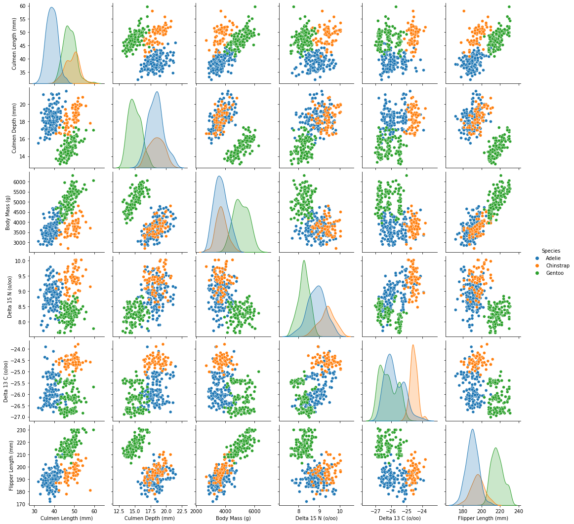
You’ll want to drop the NaN sex values, then make a dataframe consisting only of the species names and the quantitative variables, which you’ll then use to make a seaborn pair plot (in this case a matrix of such plots automatically).
# Drop the penguin with "." sex that confounds seaborn cols
penguins = penguins.drop(labels = penguins.index[penguins['Sex'] == '.'])

# Dataframe of only quantitative variables and Species
df_quant = penguins[['Species', 'Culmen Length (mm)', 'Culmen Depth (mm)', 'Body Mass (g)',
                    'Delta 15 N (o/oo)', 	'Delta 13 C (o/oo)', 'Flipper Length (mm)']]

# Pair plot - matrix of plots for quantative variable pairings
sns.pairplot(data = df_quant, hue = 'Species')
<seaborn.axisgrid.PairGrid at 0x7fc6042acf40>
The Skippable Details
The minutiae from the actual project:
In the above plot-matrix, we see that several two quantitative variable pairings do not show clear groupings by species. On the diagonal, can see, without sorting by a qualitative variable (Island or Sex), that the by-species distributions for a given single variable are often signicantly, to nearly entirely, overlapping. So, which variables stand out as strong early contenders?
Culmen Length and Culmen Depth are interesting in that Adelie and Gentoo penguins distributions swap relative position between the diagnonals for these variables, and show little overlap. However, in both cases our Chinstrap distribution exists wholely within the other two species distributions. This is somewhat mitigated by the difference in which species most subsumes the Chinstrap distribution between variables, but as seen in the plot of Culmen Length to Culmen Depth, Gentoos still fall in an unclear border region between the other two species with quite a bit of overlap on both ends.
The carbon and nitrogen isotope ratios (Delta 13 C and Delta 15 N respectively) have clear seperate peaks for each species distribution when viewed alone on the diagonal yet share the same positional order of distributions between them with significant overlap in terms of overall area, resulting in a bit of a muddle when plotted against one another. Both carbon and nitrogen variables show moderately clear clustering when plotted against some body measurement variables, but these are far from the best plots. Is it worth dropping these columns containing a high number of NaN values, or should these missing values be replaced with the mean for their respective species, either limiting the data set or potentially causing unintended consequences in order to use one of these isotope ratio variables? At this very rough stage it’s not entirely certain if either of these action will be necessary: we don’t know if these variables are good enough to even use yet. *Note: we eventually found enough of a use case for these isotope variables in our data exploration to justify replacing their NaN values with means by species in order to use them in feature selection.
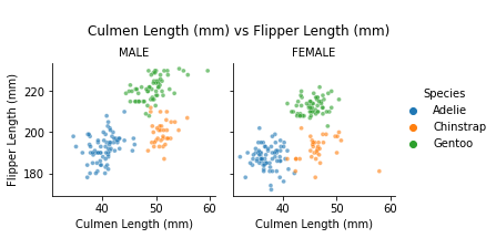
The best quantitative pairings appear to be Culmen Length/Body Mass, Culmen Length/Flipper Length, and perhaps Culmen Length/Culmen Depth if Sex or Island sorting can better distinguish Chinstrap penguins.
Looking forward, can sorting by Sex clarify the boundaries between species on these quantative plots — as seen in our table discussion — to such a degree that it is a more powerful tool than the ability to categorically eliminate entire species from contention based on Island? We will explore this question in the next comparison plot.
The Short Version
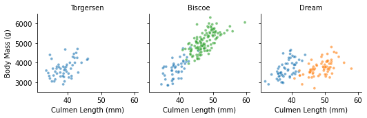
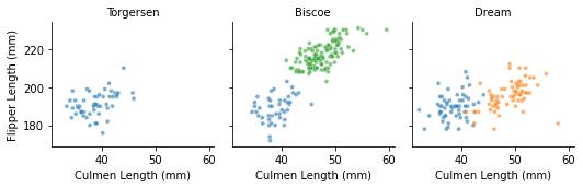
Swanky, right? Every combination in the subset dataframe is plotted in the same syntactical length/complexity as a any individual plot in seaborn or pyplot. If you want to them follow this up by the introduction of a qualitative variable like sex, you can, albeit a tad more laboriously, follow up with a comparison plot function (or just copy mine):
def comparison_plot(x, y, cols1 = "Sex", cols2 = "Island"):
  """
  Plots a pair of variables (x,y) of dataframe via seaborn, sorted by
  two different columns within that df, each forming a row of plots.
  Plots are formated such that the two sets of plots from a single function
  call will appear as a single group of plots for that x/y variable pairing,
  sharing a legend, and visually seperated from subsequent multiple calls of
  this function.

  Parameters
  ----------
  x: string. Name of df column to plot on x axis
  y: string. Name of df column to plot on y axis
  cols1: string. Name of df column to sort 1st row (1st replot call) of plots
         by via sns col parameter. Defaults to "Sex".
  cols2: string. Name of df column to sort 2nd row (2nd replot call) of plots
         by via sns col parameter. Defaults to "Island".
  """

  # Plot first column (compensatory height and aspect to account for suptitle)
  fgrid = sns.relplot(x = x, y = y, hue = "Species",
            col = cols1, data = penguins, alpha=.6, height = 3,
            aspect = .87, s = 15)

  # Create space for supertitle
  fgrid.fig.subplots_adjust(top = .75)
  # Add supertitle with blank new line for spacing between calls of function
  fgrid.fig.suptitle("\n" + x + " vs " + y)

  # Plot second column
  fgrid2 = sns.relplot(x = x, y = y, hue = "Species",
            col = cols2, data = penguins, alpha=.6, height = 2.5,
            s = 15, legend = False)

  # Set subtitles to Sex or Island name (e.g. remove "Sex =")
  fgrid.set_titles("{col_name}")
  fgrid2.set_titles("{col_name}")

comparison_plot("Culmen Length (mm)", "Culmen Depth (mm)")
comparison_plot("Culmen Length (mm)", "Body Mass (g)")
comparison_plot("Culmen Length (mm)", "Flipper Length (mm)")
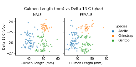
comparison_plot("Culmen Length (mm)", "Delta 13 C (o/oo)")
comparison_plot("Culmen Length (mm)", "Delta 15 N (o/oo)")
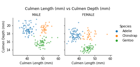
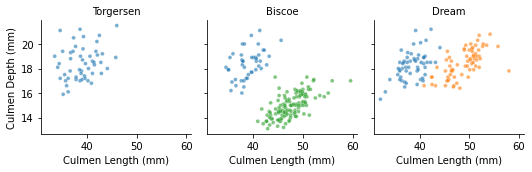
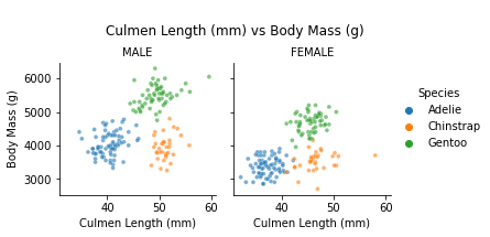
In short, you now have a sleek looking foundation for any penguin related activities. If you care to hear me ramble, my analysis of this chart from the project is included below. In anycase, thanks for stoping by!
The Analysis
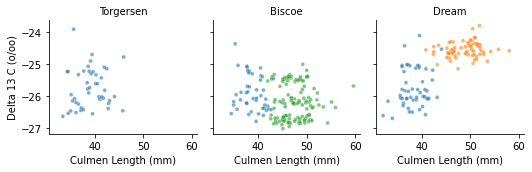
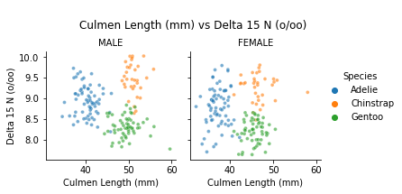
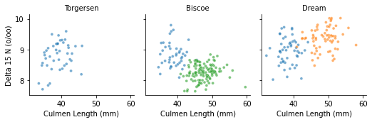
To simplify the exceptionally-thorough pair-plots we originally ran, the above comparison plots represent the most significant variable pairings with the application of Sex and Island sorting. In general, we found that Sex and Island sorting further refines the best variable pairings but do not significantly improve the ones that already performed poorly in the previous pair-plot. There were, however, a few interesting standouts:
Culmen Length vs Culmen Depth: Sex-sorting shows that female Chinstraps made up most the messy middle of our prior chart. Once sorted by Sex, the Gentoo vs. Chinstrap border clears up for both plots, and the Adelie vs. Chinstrap overlap is reduced to a single outlier in the female plot. This is now one of our most promising combinations. However, when sorted by Island, the Dream plot is still unideal, somewhat preserving the Chinstrap vs. Adelie issue found in our unsorted plot.
Culmen Length vs Delta 13 C: This pairing went from mediocre to surprisingly clean when Sex-sorted. Once again, the Island-sorted plots retained some of the issues found in the original plot, this time around the Chinstrap vs. Adelie border; however, as expected, Chinstrap/Gentoo overlaps were removed nicely.
Culmen Length vs Delta 15 N: this pairing definitely took well to island-sorting, and as it has been with our quirkier pairings mentioned thus far, when one sorting method was particularly good, the other didn’t particularly shine. In this case sex-sorting, suffers from Gentoo vs.Chinstrap overlap.
Overall, body measurements variable pairs subject to island-sorting improved compared to their no-qualitative prior iterations but may be starting to be left behind the standouts above. However, the difference between heuristically obvious combinations like Island, Culmen Length, and Culmen Depth or Island, Culmen Length, and Flipper Length and the more oblique isotope ratio combinations is certainly small enough, in terms of eye-balling graphs, to warrant the inclusion of these attributes in future cross-validation testing in our coming feature selection section.